As one of the last entities which do not have high resolution graphics, the time has come for the offshore pump.
The offshore pump is practically a 1-tile entity, but they must have a 1 tile gap between each other. It is also the only entity placed on a water tile at the moment.
When we changed the way how terrain to water transitions work, we moved the offshore pump to be placed on the water tile. This can result in the pump drawing over terrain in ugly ways.
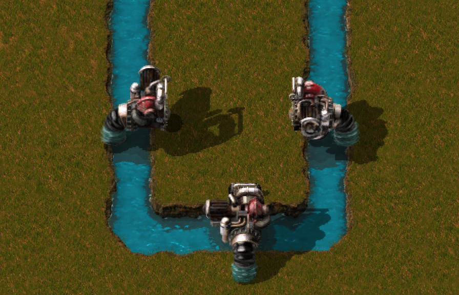
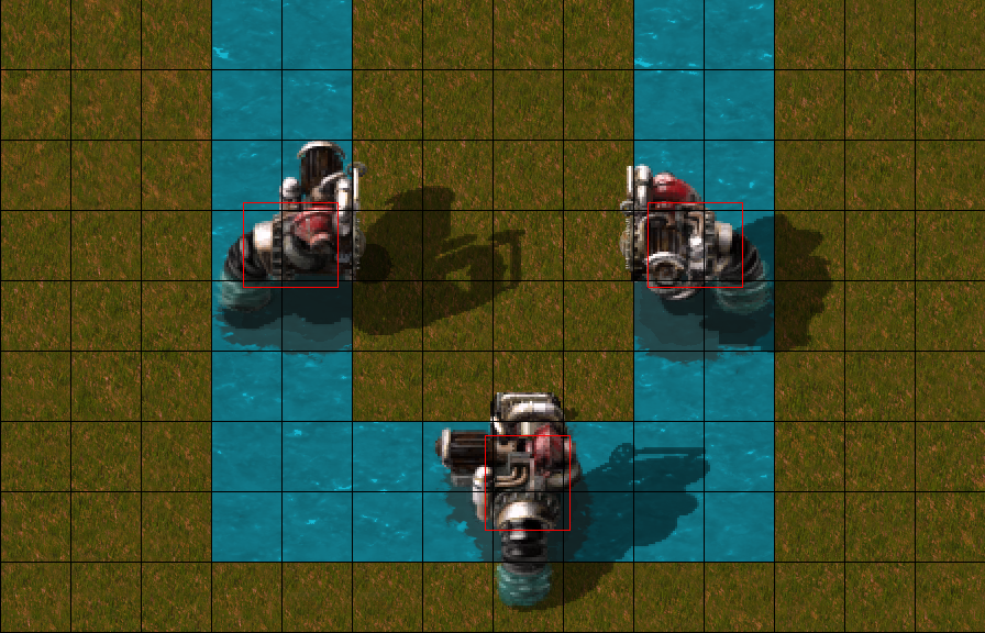
With the redesign, we took the oppourtunity to move the offshore back onto land, and additionally the pump checks a 2x3 tile water area in order to be buildable.
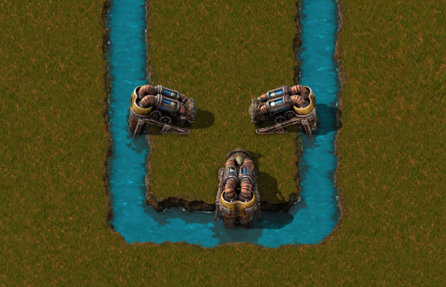
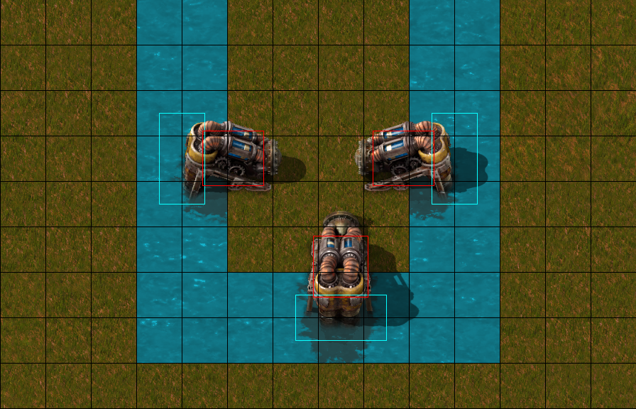
The new placement rules only applies to newly built pumps. Offshore pumps on existing maps will keep functioning, they’ll just be shifted out from the shore.
There is no blue colour for water integration at the tip of the offshore pump, so the offshore pump will look correct even with unexpected water types (not a big problem in vanilla). The water integration is split to an underwater layer which does not show when the pump gets landfilled over.
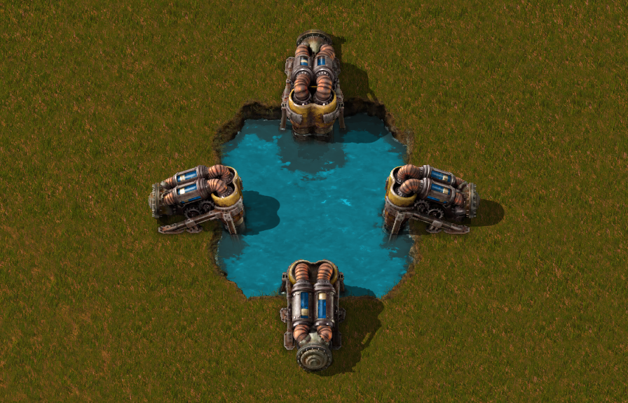
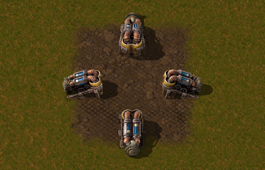
In the basic concept, the offshore pump is another type of a pump, so it should be similar to the other pump entity Albert made a few years ago, including the animation and visible fluid in it.
The obvious difference is the connection to water. However we felt that is not different enough and needs more visual balance, so we added a pair of supportive legs.
We are planning to release the new offshore pump graphics with the next release, likely next week.
Beacons strongly motivate building in rectangular repeatable patterns. The results generally look clean, but also very predictable and boring. Furthermore, the differences between different recipe builds are only minimal, so the visual difference between builds is minimal.
![]()
The issue is, I like to build the opposite of clean and predictable. The factory looking increasingly complicated and harder to expand over time is what keeps me engaged to continue playing a map. When it starts looking easy, I lose interest.
I’ve been trying to solve this for myself by either restricting myself from using Beacons (which is a massive sacrifice of productivity and speed), or by putting the sub-factories with high Beacon counts outside of the starting area, as keeping the organic starting area is key for me.
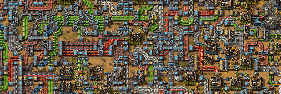
Eventually I thought about creating a mod that makes machines behave as if they had the maximum possible amount of beacons around them - allowing me to upgrade the starting base, but that also causes higher demand on the throughput of logistics, which the most interesting part - snaking more belts, fitting in more rails.
![]()
The mod defines 3 tiers for every producer to simulate beacons with tier 1, 2 or 3 of Speed modules in them. These machines cannot be further affected by normal Beacons and only accept special productivity modules defined by the mod.
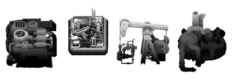
Creating the mod was a ton of fun. I rewrote it about 3 times as I was learning how to do it better. I hacked together some basic graphics for it from some special passes (height and Ambient Occlusion) that we use for postproduction in our gfx workflow.
I played with the mod and got some interesting results (imgur album) as I was able to continue building in the starting area instead of refactoring it for Beacons.
Lastly, I wrote a timelapse-screenshot tool. It can either be used by taking a screenshot each N ticks automatically, or in my case I give it a folder with savegames and it takes X number of screenshots, then moves to the next savegame. It's quite crude so I won't release it on the mod portal for now.
Making Beacons disappear into producer machines to allow for more organic bases fits my perverted playstyle, but Beacons actually do bring a lot of interesting motivations to the base game, and it can be a lot of fun to mess with the building rules that Beacons force.
You can find the mod on the mod portal if you are interested.