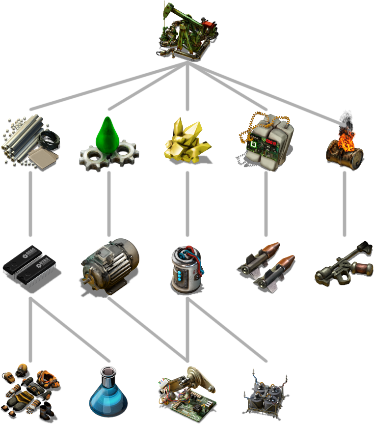
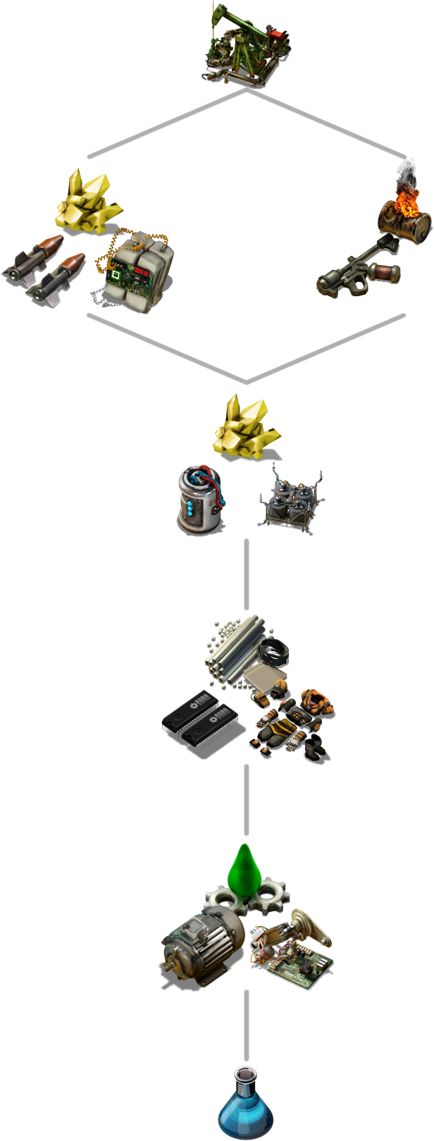
Have you ever been playing a Freeplay game and realised you don't know what your next big goal is? And then, once you decide to pick a new goal, you realise while you worked on automating the last goal, there were 10 new technologies unlocked and now you don't know which to pick next.

These are the situations we hope to address with the new full Campaign. A guided Freeplay, in which the player plays through the whole tech tree, without being overloaded with choice, while still having the permanence and unidirectional progression of Factorio. The permanence problem has already been solved using the new map expansion technique which is playable in the Introduction scenario. Over the last year we have been working on the bigger design task of unravelling the tech tree and breaking it into a set of choices for the player.
This task has been made all the more Interesting as the tech tree is also constantly getting tweaks and revisions over that time as well.
I look forward to providing more insights but for now I will leave you with one example (read: spoiler):

Just to note, we won't be changing the freeplay tech tree, which will still have all the choice and diverging paths as it does now.
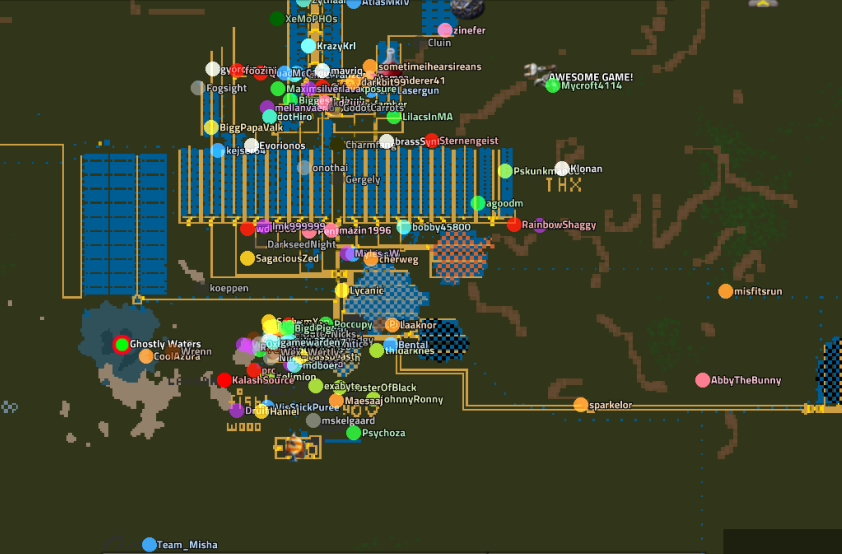
A few days ago I was contacted by Caledorn from the KatherineOfSky community. They were doing some tests to see if they can host a massive multiplayer event. I joined forces with him and started looking into the new and old problems we can fix in Factorio so we can host a large number of players. The last test was on Sunday. We had around 80-140 players playing without too many issues. But it was still a small test compared to our previous record of 400 players back in 2016.

Among some small tweaks, I added the ability to set a maximum number of map upload slots for the server. This should help tremendously for events such as these, where the map can get quite large, and there would often be a large flood of players joining, usually after a disconnect or server restart. This would cause a massive flood of map request packets coming to the server and very slow map uploads caused by uploading to way too many players. Now, when many players will try to join at the same time, they will be placed in a queue and the game will wait for an upload slot to open up.
Another small annoyance in these events (or even small multiplayer games) is the constant annoying blinking of the "Server not responding"/"Player is being dropped from the game". I made some tweaks that should show this message less often. We also found a memory leak in input action handling, which Rseding has fixed.
There are still some technical problems to investigate and fix, so tomorrow (Saturday 20th April) at around 8pm CEST we will be making another stress test. If you want to help out, join the server and play normally when the game starts. Details will be posted in the KatherineOfSky discord. If we need more players, a Steam announcement (event) notification will be sent out, so keep an eye out for that also. The server will probably become unstable or might require some restarts as we test, debug, and backtrace things, so please bear with us.
Last week I opened the subject of the high resolution icons FFF-290, more focused on the unisize method: re-scaling a single 64px bitmap to any size through trilinear interpolation. The results were very fine, and compared to the old version it was obviously a success.
This week we are focused on the mipmap method. Posila very quickly implemented the code for it, and even though I was willing to reject the technique due its extra work and complications, after testing it I changed my mind. Here a comparison with all the methods:
![]()
On the first glance the difference between unisize and mipmap is almost not noticeable, but when we surpass the boundary of zoom level 1.000, the mipmap starts to react a bit better. I was worried about the amount of work implied about the creation of the 4 levels for each icon, but after preparing a few of them, I saw that it wasn’t that much. Not to mention that having control over 4 different sizes is a big relief, especially the 16px and 8px versions.
The best part of the plan is that we can combine both methods, so we can make mipmaps only for the icons that require special attention, it is just about the Lua definition of the item.
Now, just for the joy of it, I’d like to show a sneak peak of what HR icons means for the GUI.
 GUI at 100% scale
 GUI at 200% scale
I hope this new contrast and definition results in a better experience for the player.
As always, let us know what you think on our forum.