Hello,
I wanted to write about the things I'm improving in our GUI library, but I realized, that the important part is to explain what is the motivation to do so. So let me present the history of Factorio GUI.
Back in the day when Factorio started, I was quite clueless. I needed some GUI library for allegro, and agui was the only one I could find, so I started using it. As in most of the story, I didn't really pay much attention to GUI, it was just the pesky part of the code which I needed to work in order for the game to function. There weren't much GUIs back then, and most of them were done by manually placing bunch of elements so it is possible to interact with it. The look and positioning was quite random.
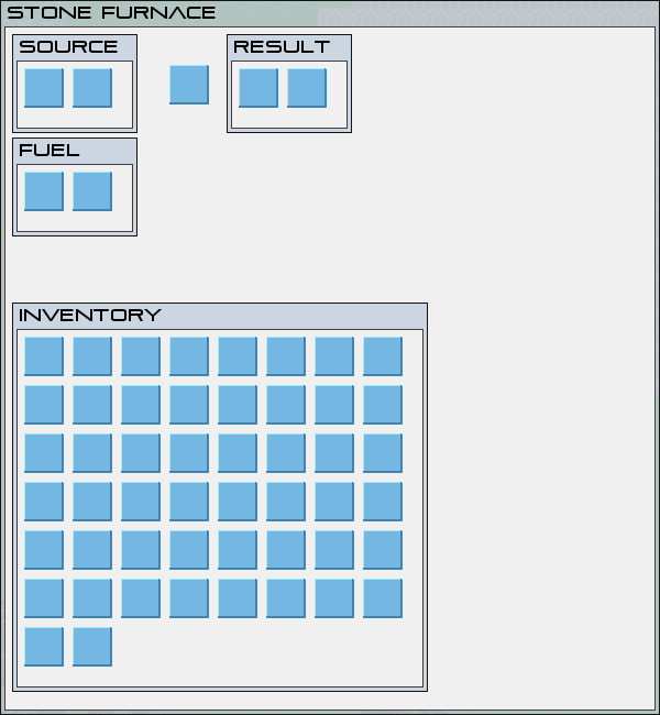
The previous strategy stopped being possible quite soon, and we realized that we can't just manually place widgets in a window, so we started to use the layout functionality to build the GUI, so it doesn't break immediately once it contains just a little bit of different data. At that time, it was good.
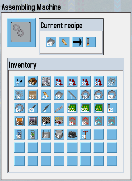
It is hard to believe now, but at that time, I was insisting, that the GUI is OK, and we don't need to improve it, but luckily, I was persuaded by Albert and Tomas that we need to give the GUI a better look. That was how was the look similar to the current one created. We needed to add hierarchical graphical style system to be able to control the looks and positioning of individual elements, so we did it. We also needed to add several additional functions to the layout mechanism as the need to make these two windows have the same height automatically and similar things. So we made specialised features for that by bending some of the original GUI library code. It usually worked, and when it didn't we made little hacks here and there to make it work. It also created new problems, like the random margins of elements that were supposed to be aligned with something. As all of this was made by unique specific numbers of widths/heights of elements, it could never work right, as all the style values were scaled depending on the resolution.
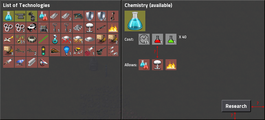
Here for example, the progress bar style was specified to have a somewhat correct width, and we didn't even care or understand how bad it is.
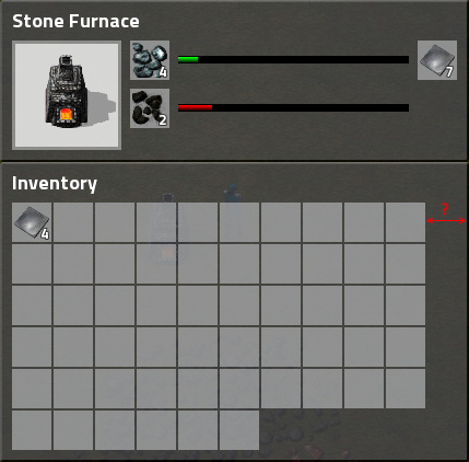
It was identified at this time, that we need some mechanism to solve these kind of problems, so I created the stretchable functionality. As I was clueless about the library internals, I was afraid to break anything, the usage of it was quite awkward, it had to be used together with the functionality of mechanism from 0.5 to stretch windows to have the same width/height. You needed to set correctly some of the style values and some of the C++ object values to make it work properly. You had to set the stretchable not only the element but all of the parent elements etc. But it worked ...
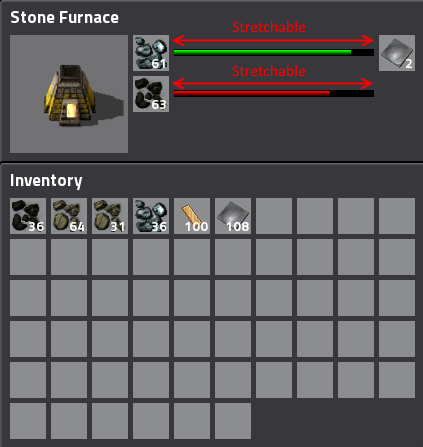
Small hacks here and there accumulated.
When you use stretch layout and set align to right doesn't work? Well just set the layout to go from right to left and put things in opposite order.
Isn't the layout doing what you need? Just calculate the needed dimensions manually and force them in the style.
And much more ..
New people started joining our team and they didn't know the subtle things you needed to push to make it work and lot of new code was created with even more hacks. The GUI started to be a crazy complex beast. At that time, one of the new programmers wanted to fix some of the hacks. The result was, that he wanted to fix everything, and after 9 months of repeated inability to show anything, he was fired. After that time, GUI was considered even more scary.
Things like this started to appear all over the place in the desparate hopes of making it work:

Some people have even shown their disgust by naming their variables:

Now we are facing the need to make the GUI update (first part was presented in one of the recent fffs). At this point, you have some idea of how painful would it be to just glue the needed additions to our current GUI. It would be painful complexity squared.
This is why I decided to roll up my sleeves and just dive into it. I started rewriting and clean-up the core parts of how the layout works. At this is point, I have a branch that has 52k lines of changes compared to master, and the internal workings of the GUI have been revised a lot. A lot of the mechanisms that had to be hacked painfully work automatically and there is much less code and knowledge needed to write the GUI in the new branch. But this also means, that we have to go through every single GUI and remove the previous hacks by the new functionality, which is a lot of work.
To aid in the GUI simplification work, we created a simple GUI debug view, to let us quickly see how are the layouts stacked. I will leave it in the game, as it could be also useful for modders when they need to debug their GUI structures.
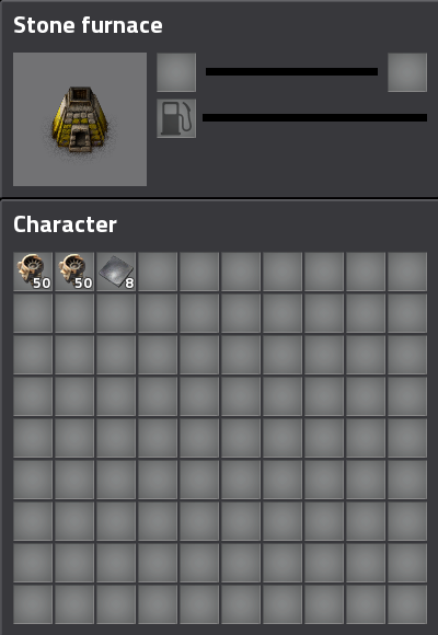
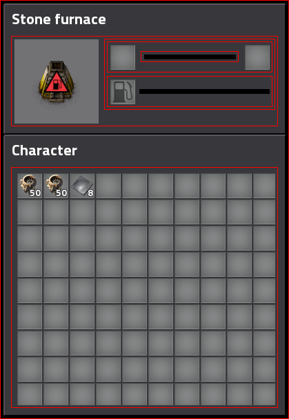
On top of that, I started to write GUI tests, as GUI layout is the great example of piece of software, where fixing one thing breaks some other without you knowing. These changes will also change the way modders specify GUI structures (mainly related to the align and stretching), but it wouldn't be us if we didn't break mod compatibility in a new release.
As always, let us know what you think on our forums.