A long time ago, in FFF-191 I wrote about improving the GUI. Well, things are finally starting to move, so this week I'll bring you an update on that. We even have a GUI team:
The plan is to go through the entire game's GUI (including main menu, all entity GUIs and all game windows) and improve it both visually and interaction wise. This is quite a huge undertaking because:
At the moment we are still early in the project, just defining the style and the concepts. During the next months, I'll try to make a series of FFF talking about the improvements we are making (starting with this one) so you can see how the project progresses, and offer feedback along the way.
Everything I mentioned in FFF-191 will be there, but we have even more cool improvements coming to the toolbar that we are working on, so today I'll talk about something else: the new train/locomotive GUI.
Disclaimers:
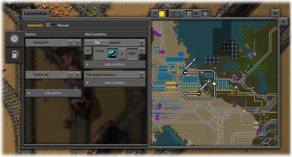
This is how the new Locomotive GUI will look. As you notice, apart from the style changes, they way the stations and conditions are shown is very different, but I'd say much more intuitive, informative, and easy to use.
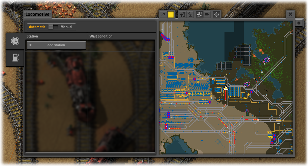
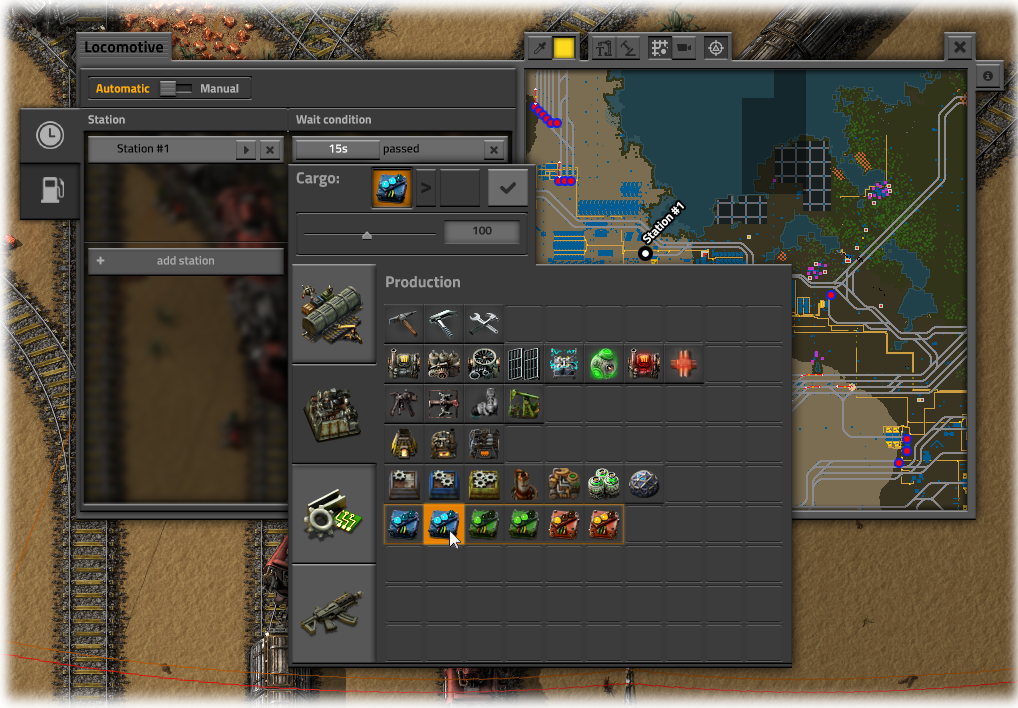
Let's go through a short use case. You click add station and the list of stations appears. You can add a station by clicking on the station in the list or by clicking it in the small map. The map can be zoomed and moved around so you can easily find your station. Also, as you hover over stations in the list, the map will show their location.
The stations marked differently are unreachable from the train's current position. This way you can more easily recognize and possibly ignore stations outside of the current network.
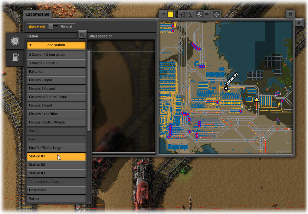
Once you click a station, it is added to the schedule, along with a default condition. You can continue adding more stations, or add/edit the conditions for the new station.
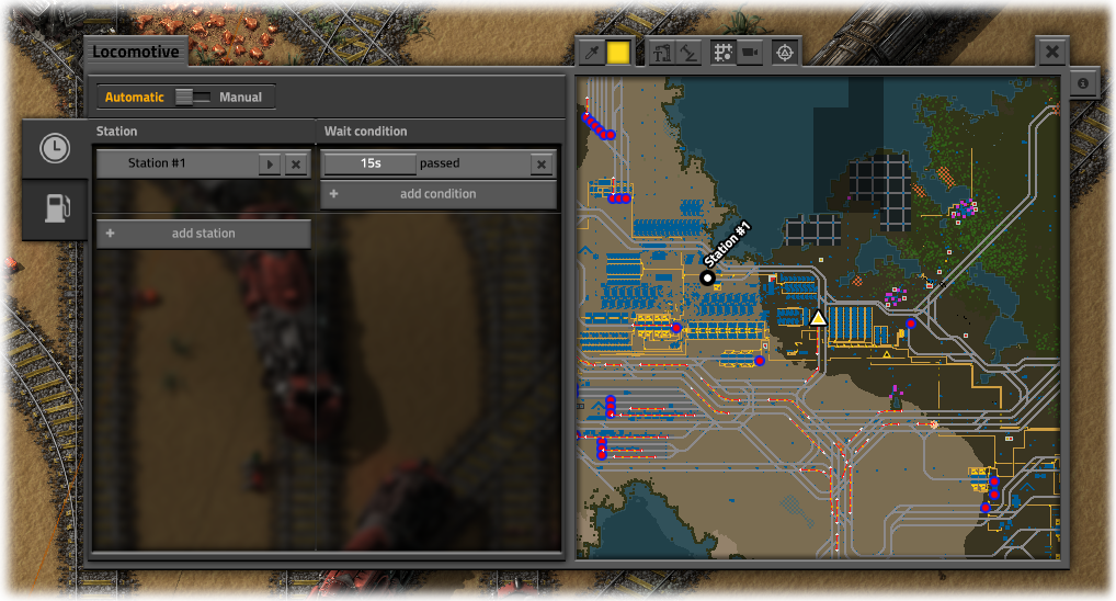

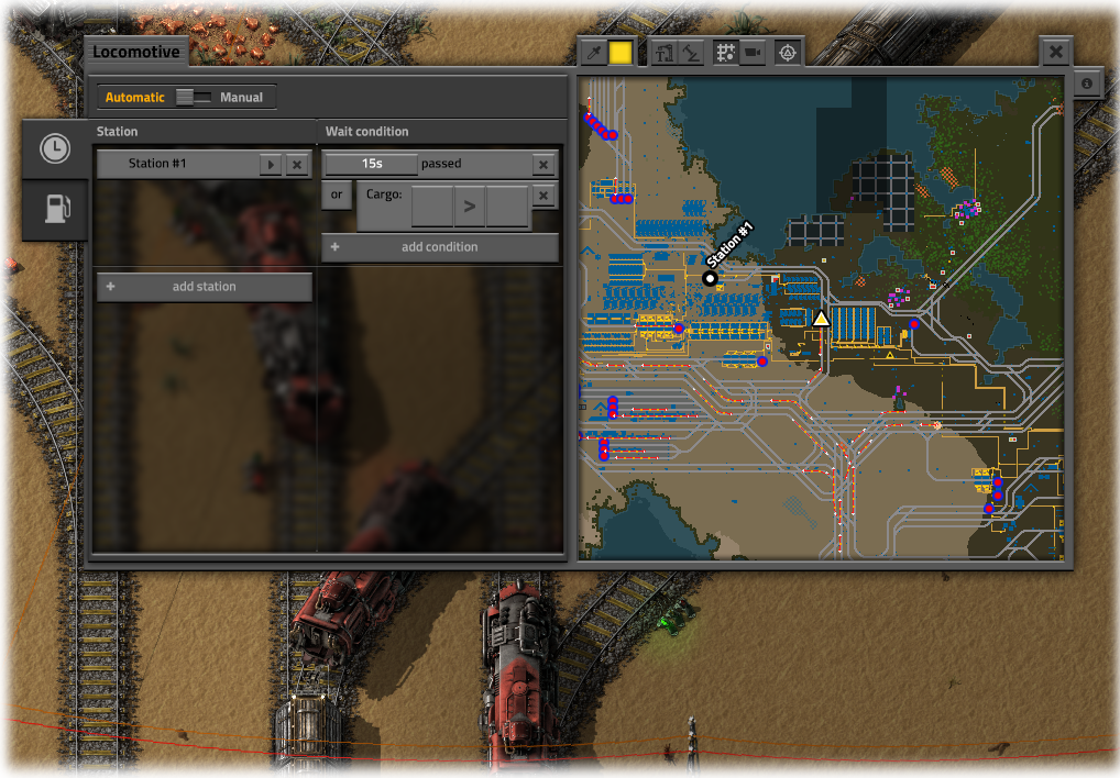
Finally a schedule can look something like this. The path of the train will be shown. We will try to paint the path the train is taking at the moment, it will change as the train takes different paths.
The fuel can be accessed from the separate tab and the color of the locomotive can be changed using the color picker.
The buttons in top of the map, from left to right are as follows:

We also want to add a neat tool for advanced players. Control-clicking on any point on the locomotive's map (or any station) will add a 'Temporary stop' to it's schedule. The train will try to go as close as it can to that point, wait a few seconds and finally automatically remove the 'Temporary stop' from it's schedule. This is very useful for quick transportation. It also allows you to quickly 'hijack' an existing train and use it to get somewhere, since the 'Temporary stop' will be deleted and the train's normal schedule will be resumed.
Another quality of life improvement will be a game option to automatically add some fuel from the player inventory when building vehicles (car, tank or locomotive), making rail transportation as simple as placing a locomotive on a rail, entering it and control-clicking where you want to go.
We hope you like the proposed changes. No doubt things will change as we implement and playtest these changes, but we thought it would be interesting to show you an early preview.
Finally the million dollar question is when will this be in game? Because it's quite a bit of work we already pushed the GUI update to 0.17. On the bright side, this mean 0.16 will come a bit sooner.
Let us know what you think by commenting in our usual topic at the forums.