Since a couple of weeks ago I was working for the 1M Party. Made some little graphic design jobs which finally became not that little and much more than "some little". I have to admit that I had quite some fun doing them, cause these small things are giving me the chance to experiment and play with the graphical identity of Factorio, like the happy logo variation, the small jumping gear, some layouts, the 1 color version of the Factorio logo and so on.

Luckily I finished the jobs with time enough as to come back to the game gfx. But to be honest, Jitka is the person who's really taking care of every single detail for the party, and preparing and organizing everything. She became a master with the stamp and other stuff that I can't reveal just to not spoil surprises.
Most of the time when converting normal-res graphics (NR) to high-res (HR), I like to take the chance to re-think the design of the entity. Normally after testing it in the game for so long, it is easy to find better solutions for old problems. But the main reason for re-designing an entity, is that it doesn't support the double resolution - because it was designed and optimized for NR - and sometimes it is because the style is primitive and doesn't fit with the actual standards of the game. Both reasons are true for the case of the electric poles.

Now that I see them again, after working for so long with the HR versions, I don't find them that bad, but it is true that there are problems, especially with the medium one. I will talk about it later. Let's start with the big pole, the 'easy' one.

The model v.1 doesn't support HR, and I always thought that it could be much nicer. This new v2.a model, is in fact a real one that exists not too far from my home. It's just perfect - in real life - but for Factorio it has some problems. The base is too thin, it needs to cover 4 tiles, and it has 6 connections instead of the 3 that Factorio requires. I asked for having 6 connections and little variations in the position and rotation of the poles, to make it more natural in the game. But the amount of work and potential problems that this would cause makes it just not viable. A really nice point of this model is how it rotates. It's very clear in its geometry, clean and transparent at the time of overlapping with other tiles.

After the first attempt, the proposed solution is more conservative. Getting back to the classic v.1. v2.b is just trying not to freak out too much, and moves forward within the comfort zone. Just the same as the v.1, but better for HR and the modern Factorio style. The problem of this model is the rotations, specifically the horizontal view, so I believe a 3rd version will come out after mixing the best parts of the other two.

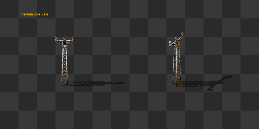
The main problem with medium and small poles, is that they are normally located in the middle of your factory, so if you have a tight setup they can be very intrusive. They need to be transparent. On the other hand, they have to be visible enough in order to feel comfortable at the time of playing. That's why medium pole v.1 is a diagonal. It is just an experiment that tries to show the tiles behind as best as possible. But to be honest I find a bit annoying the absurdity of having a diagonal pole that requires another support on the base just to be stable. What kind of engineer does a pole like that? The good part of the v.1 is that it is very unique, and you can recognize this pole as from Factorio anytime you see it. With this new model v.2a, I'm trying to simplify the shape as much as possible in order to be more light and transparent. The problem is that the horizontal rotation is not spectacular, and this sense of uniqueness is quite diluted.

So comes the medium pole v.2b, which is trying to keep the lightness of 2a, even increases it, and it tries also to recover this lost uniqueness from v.1. Rotations are not super spectacular either, but for the horizontal rotations which are the most difficult ones, this model works pretty well. I believe that a medium pole v.2c will come by taking the very best of the other models.

With this first version of the small electric pole, I had already a long and difficult process for building it. In my opinion there's not really any serious issue with it apart from the HR incompatibility. So basically v.2a is just a cleaned and stylized version of the v.1. Anyway it needs to be tested to see if it really works.
So that was a short and brief trip to the re-design for HR in Factorio. I just wanted to continue a little bit the last FFF, in order to show more deeply the process of creating an entity. Many times we speak about technical stuff, meaning code and complicated tools, but we sometimes forget to talk about conceptualization and design, which is full of techniques and twists. As you can see, everything in here is a work in progress, so we will probably speak about the final HR electric network in action soon. I hope you find it interesting.
![]()
As a bonus, I'd like to introduce you to the new version of the warning signals. I had to clean up the style a lot in order to make it very visible in any situation. Still work in progress so expect changes, but step by step Factorio looks better.
Any feedback from you is always interesting. See you in the forums.