Hello. With Christmas nearly upon us, life in the office has slowed down nearly to the point of complete hibernation. But we still bring you your scheduled programme to give you something to look forward to in the next year.
For the past few weeks, I've been working on our shiny new blueprint library. We already introduced the library in FFF 161, but to briefly recapitulate: The blueprint library is a place for you to keep your blueprints, and it does two things for you:
My task with the library is to work on the GUI to make it nice and easy to use. Even though slpwnd said in FFF 161 that the UI is “(hopefully) intuitive to work with” – my initial reaction to the GUI was that it was a cruel and unusual punishment for our users.
One of my biggest gripes was that you had to open the blueprint and then click a button in order to copy it to the library. Getting a blueprint out was a similar process – open it, press a button and you get a blueprint item. On a certain level this made sense – items in the library are not items but rather special records – special in a way that they can be saved on the disk or sent over the network in multiplayer. From a UI point of view, however, it didn't make much sense.
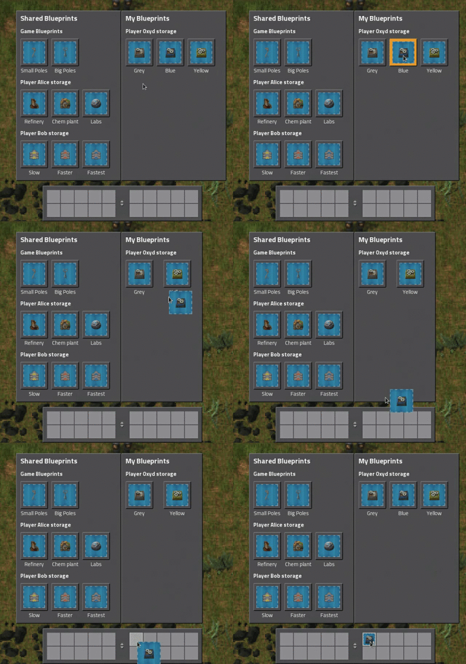
With a bit of work, we've managed to make it so that you can simply move a blueprint from the library window into your hotbar like you would any other item. Converting the blueprint record into a blueprint item is handled mostly transparently.

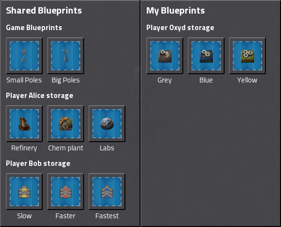
The library window itself has received a bit of a redesign since the last time we showed it in an FFF. Here is the current look of the library:

One of the changes is that it displays the blueprint name under its icon. Did you know you could rename blueprints? You can, even in 0.14. Naming blueprints will be very useful with the library, as you can stuff only so much information into the preview icon to help you remember which blueprint is which.
Another big change is that we changed the library to a two-panel window. On the right, you can see all of your blueprints – these are the ones that are saved on your disk and follow you from save to save. They are also automatically shared with others in an MP game. The left panel houses other players' blueprints, and it's there you'll be able to get someone else's blueprint from.
A topic of great debate was what to do with the “Game Blueprints” section in order to make it easy to understand what it's for and how it works. Game Blueprints are blueprints associated with the save itself – they are useful for save-specific blueprints that you don't want to drag along with you to every save you play. They are also useful for server-specific setups: When a new player joins an MP game, they can be directed to grab blueprints from this section, rather than being told to hunt them from various other players (who may not even be on at the time!).
I'm still not completely convinced that this is the correct place for Game Blueprints to be. Game Blueprints are somewhat special in that they are tied to a specific save, and in this sense, they don't belong to the left panel. However, introducing a third panel would make the window too wide in my opinion. The interface is still very much work in progress, though, and perhaps we'll figure out an even better way to do it soon.
Seeing how much of a struggle a handful of GUI windows can mean for us, we've been looking for a UI and UX designer. And as a bit of an early Christmas gift, we actually found one! Say hello to Norbert, our official GUI guy.
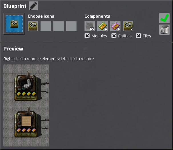
Norbert is starting for real in January, but he has already spent a week with us. During his week with us he was mostly getting to grips with the rest of the team, but even so he managed to come up with an improved design for one of our GUIs – the blueprint preview GUI.

This is the window you see when you first create a blueprint, or when you open a blueprint item by right-clicking it. it really is the same as it always was, but rearranged.
Remember how I told you earlier in this article you could rename blueprints? In 0.14, there is an icon next to the “Blueprint” title that looks like a refresh button. That's how you rename it. Maybe it should not have taken a UI designer to tell us that that was the wrong icon for the task, but at least someone finally told us.
Another point Norbert made was that the old GUI didn't make it entirely clear that you could select which icons would show up on the blueprint item in your inventory. And while we're at it, why not make the preview icon larger so you can see the icons better?
Like everything else, even this GUI is still a work in progress – the annoyingly green tick mark icon is my own creation – Albert will make it look good once he gets around to it, don't you worry. Still, I hope you will appreciate the improvements being done, and maybe Factorio's GUI will be less quirky one day.
So let us know if you have any thoughts and opinions you'd like to share over on our forum.